Contemporary Color Palettes for Exteriors
Explore the evolving world of exterior design with a focus on contemporary color palettes. Whether you’re revamping a traditional home or crafting a brand-new build, the right colors can transform curb appeal, express personality, and reflect the latest architectural trends. This guide delves into on-trend exterior palettes, the roles of neutrals and bold shades, coordination tips, climate adaptation, and innovative applications, offering inspiration and practical advice for elevating any façade.
Understanding Contemporary Exterior Color Trends
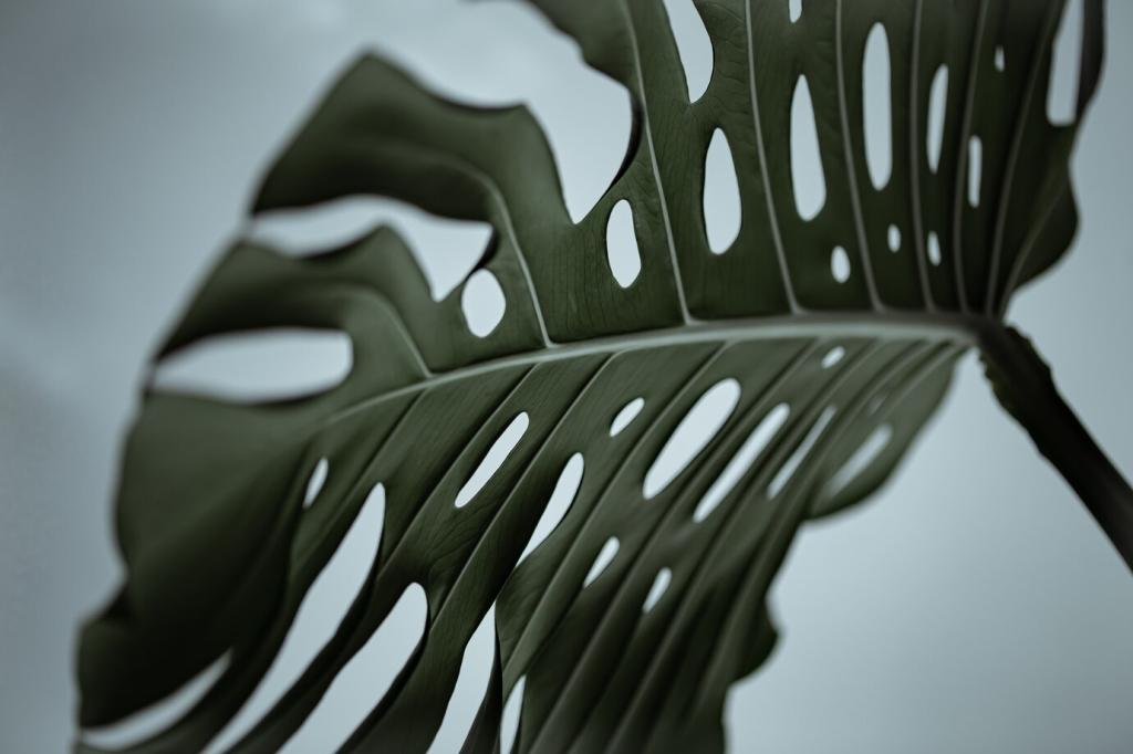
Muted natural tones have gained significant traction in contemporary exteriors. Think warm taupes, gentle greys, and soft olive greens that blend seamlessly with a home’s surroundings. These hues convey warmth while maintaining a sophisticated, understated vibe. Their versatility allows them to complement a variety of architectural styles, from mid-century modern to Scandinavian-inspired simplicity. Homeowners are drawn to these colors for their ability to create a sanctuary-like feeling while still feeling fresh and stylish. The muted approach ensures exteriors never feel stark but rather welcoming and integrated.

Crisp Whites for Freshness and Volume
Clean, luminous whites are frequently chosen for their ability to emphasize the form and architecture of a home. Using white as an exterior color creates a sense of spaciousness and brightness, instantly increasing curb appeal and imparting a fresh, contemporary look. Modern whites are carefully selected to avoid a clinical feel, instead opting for subtle undertones that work with natural light and neighboring colors. This approach highlights lines, details, and materials, making the home appear both welcoming and graphically striking.
Warm Greys and Greiges as New Classics
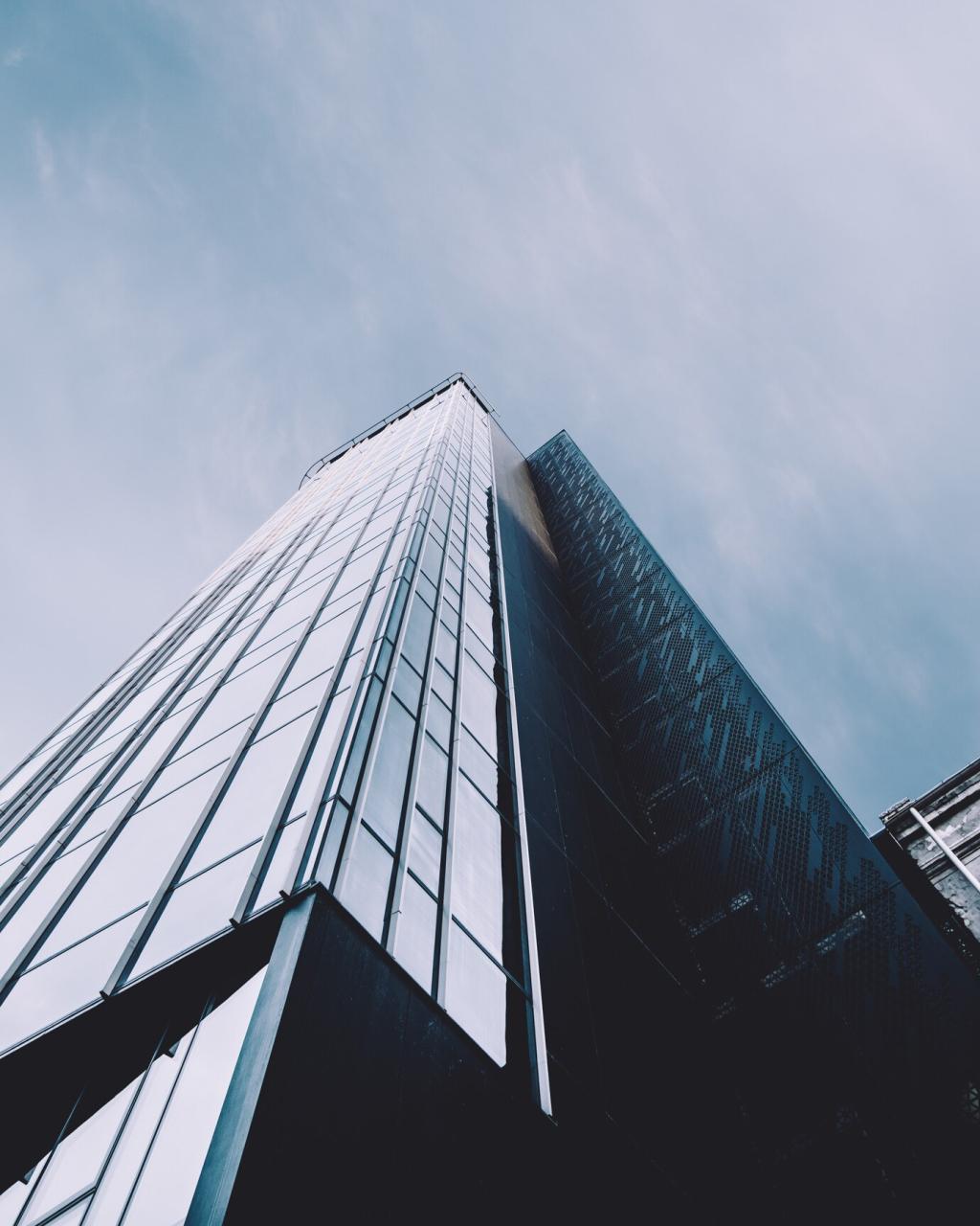
The contemporary move from stark, cold greys to warmer greige tones has reshaped neutral palettes. Greige—a blend of grey and beige—offers sophistication without the risk of looking sterile, while pairing beautifully with wood, metal, or stone accents. These hues have become go-to options among architects seeking a refined, understated vibe that works in both urban and natural environments. Their adaptability makes them suitable for different climatic conditions, and they serve as a solid base for layering complementary or contrasting tones.
Earthy Taupes and Sandstone Hues
Earth-inspired neutrals like taupe and sandstone offer a softer, organic feel well suited to contemporary exteriors. These shades echo the landscapes that surround them, providing a sense of rootedness and calm. They are especially effective for homes in suburban or rural settings, anchoring built forms to their environment and working effortlessly with greenery and natural materials. The depth and subtlety of these colors make them a favorite for those hoping to achieve a harmonious, timeless look that won’t feel dated as trends shift.
Complementary Pairings for Balance
One foundational strategy is using complementary color pairings—colors positioned opposite one another on the color wheel—to establish visual balance. In contemporary design, this might mean pairing muted base hues with vibrant accents or balancing cool and warm tones for dynamic but harmonious results. These pairings can draw attention to specific architectural elements or simply create a pleasing rhythm across the building façade. Choosing pairs with similar intensity ensures the effect feels deliberate, sophisticated, and pleasing to the eye.

Layering Tones for Depth
Layering involves working with variations of a single color or adjacent shades to create depth and sophistication. This approach offers subtlety and nuance, allowing a home to appear more dimensional and less flat. By selecting lighter and darker versions of the same hue for walls, trim, and architectural features, designers achieve a dynamic look that shifts throughout the day with the changing light. This technique not only complements the home’s textures and materials but also ensures that bold or neutral palettes feel rich and multifaceted.
Harmonizing with Landscape Elements
Integrating the palette with surrounding landscape elements is key for a cohesive, natural look. Contemporary design often seeks to blur the lines between built and natural environments by mirroring or complementing the hues found in gardens, trees, and hardscaping. Whether matching a stone driveway, echoing green foliage, or blending into the hues of the local terrain, careful palette selection enhances the property’s overall harmony and sense of place. This method creates exteriors that are both visually outstanding and deeply connected to their setting.
Different climates and exposures impact how exterior colors appear, making it essential to test shades in situ before finalizing a palette. Bright, sun-baked regions can wash out pale hues but make darker colors pop, while shaded, forested environments can mute rich colors and emphasize undertones. Assessing how colors look throughout the day, under varying weather conditions, helps ensure a selection that feels just right year-round. Smart adaptation avoids surprises, ensuring the home looks as intended in its specific environment.
Climate and Environment: Tailoring Palettes for Place

The Psychology of Color in Exterior Design
Many modern exteriors are designed to create a sense of retreat and calm, especially in bustling urban settings. Cool, muted palettes with gentle greens, smokey blues, or soft beige tones help foster this effect, signaling a peaceful haven from the outside world. Designers use these palettes to envelop the structure in a sense of tranquility, enhancing the emotional comfort of those approaching and entering the property. This approach resonates particularly in homes intended as sanctuary spaces, where the exterior sets the stage for relaxation and well-being.
Architectural Color Blocking
Color blocking describes the technique of dividing a façade into distinct sections—each with its own color—highlighting architectural volumes, lines, and textures. This method adds rhythm and visual interest, guiding the eye across the building and enhancing the contemporary look. By choosing harmonious or intentionally contrasting hues, designers manipulate perception of scale and proportion, sometimes making a small house seem grander or a large one more approachable. Successful color blocking demands a careful eye for balance and cohesion, but rewards with striking modern visuals.
Mixed-Material Palettes for Texture and Contrast
Combining multiple materials—such as timber with stone, or metal with rendered surfaces—introduces tactile interest while expanding palette possibilities. This approach allows for complex juxtapositions: warm wood stains matched with cool concrete paint, or matte metals paired with smooth stucco in varying colors. Each material absorbs and reflects color differently, creating layers of interest that shift with the light. Mixed-material designs highlight craftsmanship and provide resilience, while letting owners express individuality through inventive pairings.
Integrating Natural and Industrial Influences
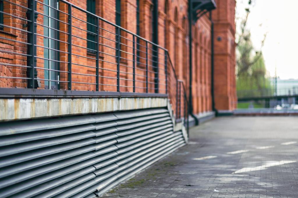
A signature move in contemporary design is to marry natural and industrial elements within the same exterior, creating a sophisticated tension. For example, rust-colored Corten steel might flank pale stonework, or sleek black metal elements offset reclaimed timber. The color palette connects these disparate materials, ensuring the overall look remains unified and intentional. This synthesis results in exteriors that feel both innovative and welcoming, sitting comfortably in urban, suburban, or rural contexts and reflecting the eclectic tastes of the modern homeowner.
Tips for Choosing and Applying Contemporary Palettes
Before committing to a full exterior, testing color samples in situ is crucial. Factors like sunlight, shade, and surrounding elements can dramatically impact the perception of a hue. Observing colors at different times of the day and in varying weather conditions helps prevent surprises and ensures that the chosen palette looks as intended once applied at scale. Sampling also offers a chance to experiment with accent colors and finishes, validating choices before a significant investment in time and materials.
